
When producing for TV commercials, the decision of which font to use is always epic. There are tens of thousands of type fonts in existence today, with many more created daily. Fonts used for television production must be chosen carefully, to make sure the viewer understands the information quickly.
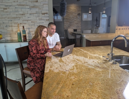
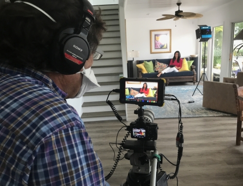
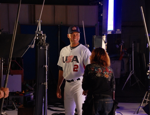
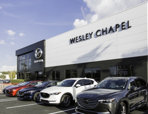
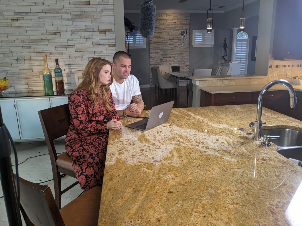
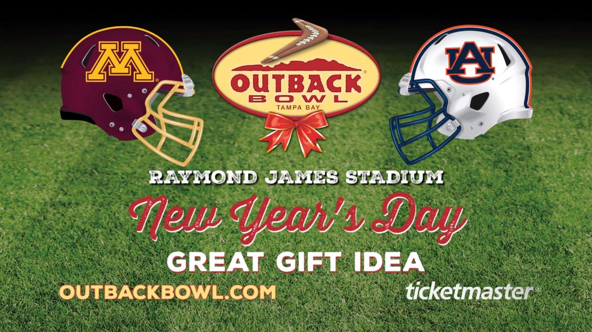
In the decision making process for Shooting Stars Post, the first question is, “where is the font going to live and how is going to be used?” Today, the answer could be a multitude of different sizes and formats e.g. tablets, cell phones, billboards, broadcast TV, web , print and/or all of the above! South Tampa production company, Shooting Stars Post has produced thousands of TV commercials and are exceptional at picking the right fonts! “We use a variety of fonts, looks and animations in our automotive TV commercials to create call to action graphics,” says John Samaha, CEO of Shooting Stars.
When producing video for our clients in Florida or anywhere else, we refer back to one of America’s finest directors, Stanley Kubrick, for his favorite. Wait for it…Futura Extra Bold! Yeah, in 1999 the title graphics in “Eyes Wide Shut” were Futura Extra Bold. “We use a variety of fonts in our TV commercials, always making sure they are clean and easy to read” says John Samaha.
The film title comes from a quote on marriage from Benjamin Franklin, “Keep your eyes wide open before marriage, half shut afterwards.” Webster, Patrick. Love and Death in Kubrick: A Critical Study of the Films from Lolita Through Eyes Wide Shut, McFarland (2011)
So, we have one of America’s foremost film Director’s, quoting one of America’s Founding Fathers and his use of type can be an inspiration. Using typography in film making or TV advertising is equal parts art and science! Happy July 4th, America!
